Load Libraries
# Loading the necessary packages
suppressWarnings(library(tidyverse))
library(knitr)
library(lubridate)
library(ggplot2)
library(dplyr)# Loading the necessary packages
suppressWarnings(library(tidyverse))
library(knitr)
library(lubridate)
library(ggplot2)
library(dplyr)# read in data
study_data <- read.csv("data/study_data.csv")
kable(head(study_data))| X | Course.Identifier | College | Department | Merged | Subject.Code | Catalog.Number | Course.Description | Course.Level | Total.Student.Count | D_GRADE_COUNT | FAIL_GRADE_COUNT | WITHDRAW_GRADE_COUNT | DEW_COUNT | PASS_GRADE_COUNT | WITHDRAW_FULLMED_GRADE_COUNT | INCOMPLETE_UNGRADED_COUNT | TERM_LD | ACAD_YR_SID | Percent.D.Grade | Percent.E.Grade | Percent.W.Grade | Percent.DEW | Percent.Passed | Per.Full..Medical.Withdrawal | Per.Ungraded..Incomplete | P.F.Opt | Units | Mode | Class.. | Sections | Total.Enroll | Max.Enroll | Rm.Cap | Early_Morning | Mid_Morning | Early_Afternoon | Mid_Afternoon | Evening | Asynchronous | Monday | Tuesday | Wednesday | Thursday | Friday | Saturday | Sunday | Laboratory | Lecture | Colloquim | Seminar | Workshop | Discussion | Studio | Practicum | In_Person | Full_Online | IntractTV | Hybrid | Live_Online | Reg_Session | First_Half_Session | Second_Half_Session | First_Third_Session | Second_Third_Session | Third_Third_Session | Ten_Week | Thirteen_Week | Other | College_Number |
|---|---|---|---|---|---|---|---|---|---|---|---|---|---|---|---|---|---|---|---|---|---|---|---|---|---|---|---|---|---|---|---|---|---|---|---|---|---|---|---|---|---|---|---|---|---|---|---|---|---|---|---|---|---|---|---|---|---|---|---|---|---|---|---|---|---|---|---|---|---|
| 1 | Fall 2019_ACBS_102L | College of Agric and Life Sci | Animal&Biomedical Sciences-Ins | ACBS_102L | ACBS | 102L | Intro to Animal Sci Lab | Lower Division | 250 | 8 | 7 | 3 | 18 | 229 | 3 | 0 | Fall 2019 | 2020 | 3.2 | 2.8 | 1.2 | 7.2 | 91.6 | 1.2 | 0 | 1 | In Person | 450809 | 8 | 250 | 280 | 8 | 0 | 0 | 8 | 0 | 0 | 0 | 0 | 4 | 0 | 4 | 0 | 0 | 0 | 8 | 0 | 0 | 0 | 0 | 0 | 0 | 0 | 8 | 0 | 0 | 0 | 0 | 8 | 0 | 0 | 0 | 0 | 0 | 0 | 0 | 0 | 1 | |
| 2 | Fall 2019_ACBS_102R | College of Agric and Life Sci | Animal&Biomedical Sciences-Ins | ACBS_102R | ACBS | 102R | Introd to Animal Science | Lower Division | 267 | 7 | 10 | 2 | 19 | 244 | 4 | 0 | Fall 2019 | 2020 | 2.6 | 3.7 | 0.7 | 7.1 | 91.4 | 1.5 | 0 | 3 | In Person | 41166 | 1 | 267 | 299 | 300 | 1 | 0 | 0 | 0 | 0 | 0 | 0 | 1 | 0 | 1 | 0 | 0 | 0 | 0 | 1 | 0 | 0 | 0 | 0 | 0 | 0 | 1 | 0 | 0 | 0 | 0 | 1 | 0 | 0 | 0 | 0 | 0 | 0 | 0 | 0 | 1 | |
| 3 | Fall 2019_ACBS_142 | College of Agric and Life Sci | Animal&Biomedical Sciences-Ins | ACBS_142 | ACBS | 142 | Intro Anml Racing Indus | Lower Division | 28 | 0 | 2 | 0 | 2 | 26 | 0 | 0 | Fall 2019 | 2020 | 0.0 | 7.1 | 0.0 | 7.1 | 92.9 | 0.0 | 0 | 2 | In Person | 25697 | 1 | 28 | 20 | 80 | 1 | 0 | 0 | 0 | 0 | 0 | 1 | 0 | 1 | 0 | 0 | 0 | 0 | 0 | 1 | 0 | 0 | 0 | 0 | 0 | 0 | 1 | 0 | 0 | 0 | 0 | 1 | 0 | 0 | 0 | 0 | 0 | 0 | 0 | 0 | 1 | |
| 4 | Fall 2019_ACBS_160D1 | College of Agric and Life Sci | Animal&Biomedical Sciences-Ins | ACBS_160D1 | ACBS | 160D1 | Hum+Anml Interl Dom-Pres | Lower Division | 681 | 30 | 72 | 8 | 110 | 561 | 10 | 0 | Fall 2019 | 2020 | 4.4 | 10.6 | 1.2 | 16.2 | 82.4 | 1.5 | 0 | 3 | In Person | 95423 | 2 | 481 | 707 | 912 | 1 | 1 | 0 | 0 | 0 | 0 | 2 | 0 | 2 | 0 | 2 | 0 | 0 | 0 | 2 | 0 | 0 | 0 | 0 | 0 | 0 | 2 | 0 | 0 | 0 | 0 | 2 | 0 | 0 | 0 | 0 | 0 | 0 | 0 | 0 | 1 | |
| 5 | Fall 2019_ACBS_160D1 | College of Agric and Life Sci | Animal&Biomedical Sciences-Ins | ACBS_160D1 | ACBS | 160D1 | Hum+Anml Interl Dom-Pres | Lower Division | 681 | 30 | 72 | 8 | 110 | 561 | 10 | 0 | Fall 2019 | 2020 | 4.4 | 10.6 | 1.2 | 16.2 | 82.4 | 1.5 | 0 | 3 | FullOnline | 67075 | 1 | 200 | 200 | 1 | 0 | 0 | 0 | 0 | 0 | 1 | 0 | 0 | 0 | 0 | 0 | 0 | 0 | 0 | 1 | 0 | 0 | 0 | 0 | 0 | 0 | 0 | 1 | 0 | 0 | 0 | 1 | 0 | 0 | 0 | 0 | 0 | 0 | 0 | 0 | 1 | |
| 6 | Fall 2019_ACBS_195F | College of Agric and Life Sci | Animal&Biomedical Sciences-Ins | ACBS_195F | ACBS | 195F | Careers/Veterinary Sci | Lower Division | 205 | 11 | 17 | 1 | 29 | 173 | 3 | 0 | Fall 2019 | 2020 | 5.4 | 8.3 | 0.5 | 14.1 | 84.4 | 1.5 | 0 | 1 | In Person | 38050 | 1 | 205 | 190 | 300 | 0 | 1 | 0 | 0 | 0 | 0 | 0 | 0 | 1 | 0 | 0 | 0 | 0 | 0 | 0 | 0 | 0 | 0 | 0 | 0 | 0 | 1 | 0 | 0 | 0 | 0 | 1 | 0 | 0 | 0 | 0 | 0 | 0 | 0 | 0 | 1 |
# Filter the data for the specified colleges and TERM_LD values
selected_colleges <- c('College of Agric and Life Sci', 'College of Humanities','College of Science', 'College of Social & Behav Sci', 'Eller College of Management')

selected_terms <- c('Fall 2018', 'Spring 2019', 'Fall 2019', 'Spring 2020', 'Fall 2020', 'Spring 2021')

filtered_data <- study_data %>%
filter(College %in% selected_colleges & TERM_LD %in% selected_terms)#DEW count (K) for 5 colleges over semesters
# Aggregate the data
aggregated_data <- filtered_data %>%
group_by(College, TERM_LD) %>% # group by college and term_ld
summarise(DEW_COUNT = sum(DEW_COUNT)) # summarize on the basis of sum of DEW grades.
# Convert TERM_LD to a factor with a specific order
filtered_data$TERM_LD <- factor(filtered_data$TERM_LD, levels = selected_terms)
plot <- ggplot(aggregated_data, aes(x = factor(TERM_LD, levels = selected_terms), y = DEW_COUNT, color = College, group = College)) +
geom_line() +
geom_point() +
labs(
title = "",
x = "Term",
y = "Total DEW Count"
) +
theme_minimal() +
theme(axis.text.x = element_text(angle = 45, hjust = 1, size=10), axis.text.y = element_text(size=15))
plot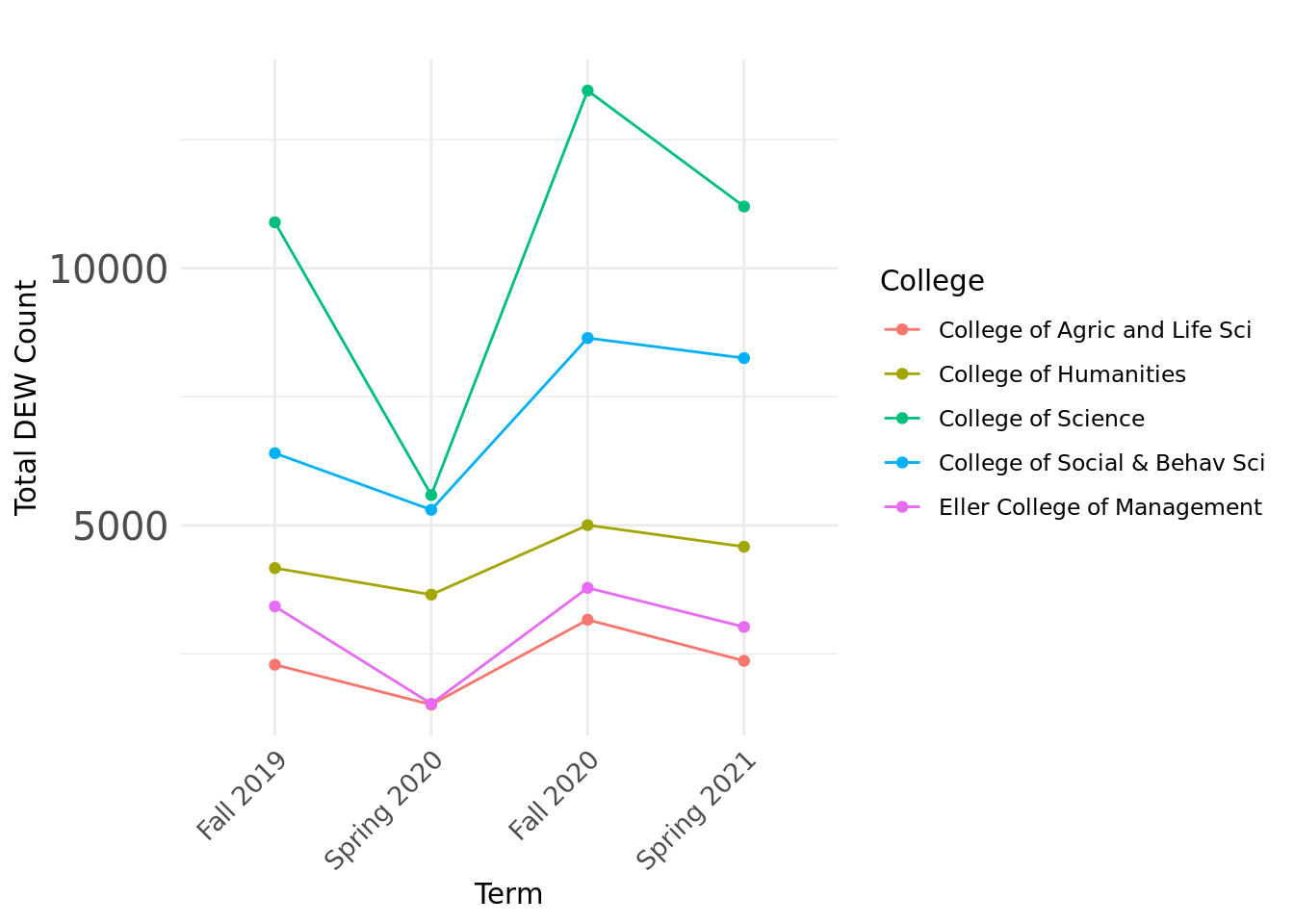
Caption: This graph shows the change in DEW grades over semesters for the colleges. The drop in DEW grades in Spring 2020 and then the rise in Fall 2020 are some useful insights drawn from this.
# DEW counts (H, I, J) for 5 colleges (Facet) over semesters

# Aggregate the data by College, TERM_LD, and calculate the sum of D_GRADE_COUNT, FAIL_GRADE_COUNT, and WITHDRAW_GRADE_COUNT
aggregated_data <- filtered_data %>%
  group_by(College, TERM_LD) %>%
  summarise(D_GRADE_COUNT = sum(D_GRADE_COUNT),
            FAIL_GRADE_COUNT = sum(FAIL_GRADE_COUNT),
            WITHDRAW_GRADE_COUNT = sum(WITHDRAW_GRADE_COUNT))

# Convert TERM_LD to a factor with a specific order
aggregated_data$TERM_LD <- factor(aggregated_data$TERM_LD, levels = selected_terms)

# Create a facet plot with lines for time series analysis
plot2<-ggplot(aggregated_data, aes(x = TERM_LD, group = College)) +
  geom_line(aes(y = D_GRADE_COUNT, color = "D_GRADE_COUNT"), size = 1) +
  geom_line(aes(y = FAIL_GRADE_COUNT, color = "FAIL_GRADE_COUNT"), size = 1) +
  geom_line(aes(y = WITHDRAW_GRADE_COUNT, color = "WITHDRAW_GRADE_COUNT"), size = 1) +
  geom_point(aes(y = D_GRADE_COUNT, color = "D_GRADE_COUNT"), size = 2) +
  geom_point(aes(y = FAIL_GRADE_COUNT, color = "FAIL_GRADE_COUNT"), size = 2) +
  geom_point(aes(y = WITHDRAW_GRADE_COUNT, color = "WITHDRAW_GRADE_COUNT"), size = 2) +
  labs(title = "",
       x = "Term",
       y = "Total Count",
       color = "Category") +
  scale_color_manual(values = c("D_GRADE_COUNT" = "blue", "FAIL_GRADE_COUNT" = "red", "WITHDRAW_GRADE_COUNT" = "green")) +
  facet_wrap(~College) +
  theme_minimal()+
  theme(axis.text.x = element_text(angle = 45, hjust = 1, size=10), axis.text.y = element_text(size=10),
        strip.text = element_text(size = 10, angle = 0, hjust = 0.5),
        legend.position = "bottom",  # Place legend at the bottom
        legend.direction = "horizontal",  # Display legend horizontally
        legend.box = "horizontal")  # Align legend items horizontally

plot2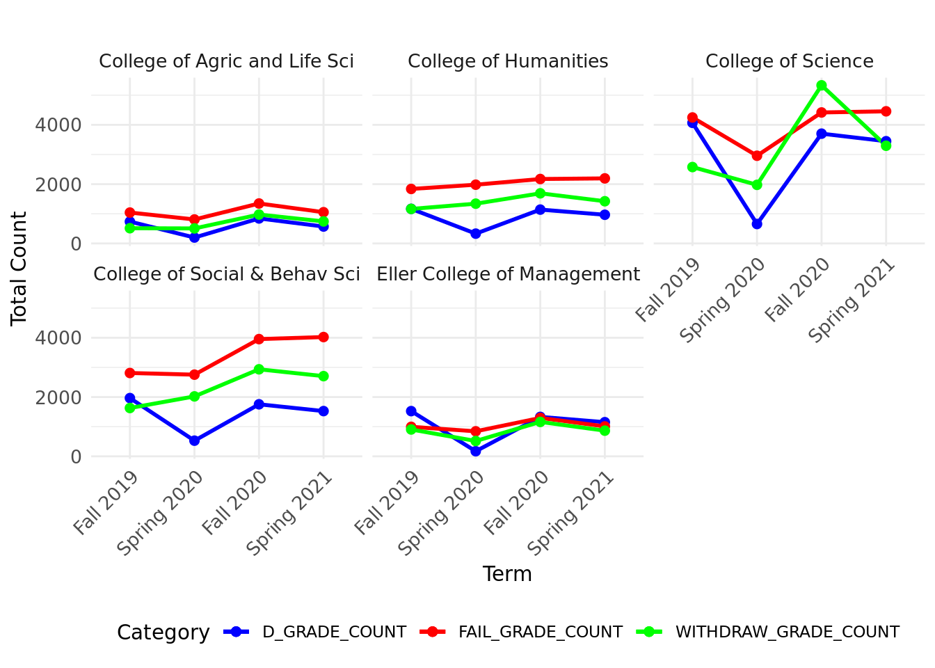
Caption: This graph shows the change in DEW grades (each grade) over semesters for the colleges. Here, it is clearly visible that there are more Failing Grades (E grade) when compared to other grades in almost all colleges.
# Number of students attending different division classes

# Rename the 'course.level' column to 'Course_Level'
filtered_data <- filtered_data %>%
  rename(Course_Level =     Course.Level)

grouped_data <- filtered_data %>%
  group_by(College, TERM_LD, Course_Level) # group by college and term_ld

# Convert TERM_LD to factor with ordered levels
grouped_data$TERM_LD <- factor(
  grouped_data$TERM_LD,
  levels = selected_terms,
  ordered = TRUE
)


# Summarize the grouped data to get the desired summary statistics
summary <- grouped_data %>%
  summarise(
    count = n()
  )

# Plotting the facet line graph with adjusted strip text labels and legend at the bottom
plot3 <- ggplot(summary, aes(x = TERM_LD, y = count, group = Course_Level, color = Course_Level)) +
  geom_line() +
  geom_point() +
  facet_wrap(~College) +
  labs(
    title = "",
    x = "Term",
    y = "Count"
  ) +
  theme_minimal() +
  theme(axis.text.x = element_text(angle = 45, hjust = 1,  size=10), axis.text.y = element_text(size=10),
        strip.text = element_text(size = 10, angle = 0, hjust = 0.5),
        legend.position = "bottom",  # Place legend at the bottom
        legend.direction = "horizontal",  # Display legend horizontally
        legend.box = "horizontal")  # Align legend items horizontally

plot3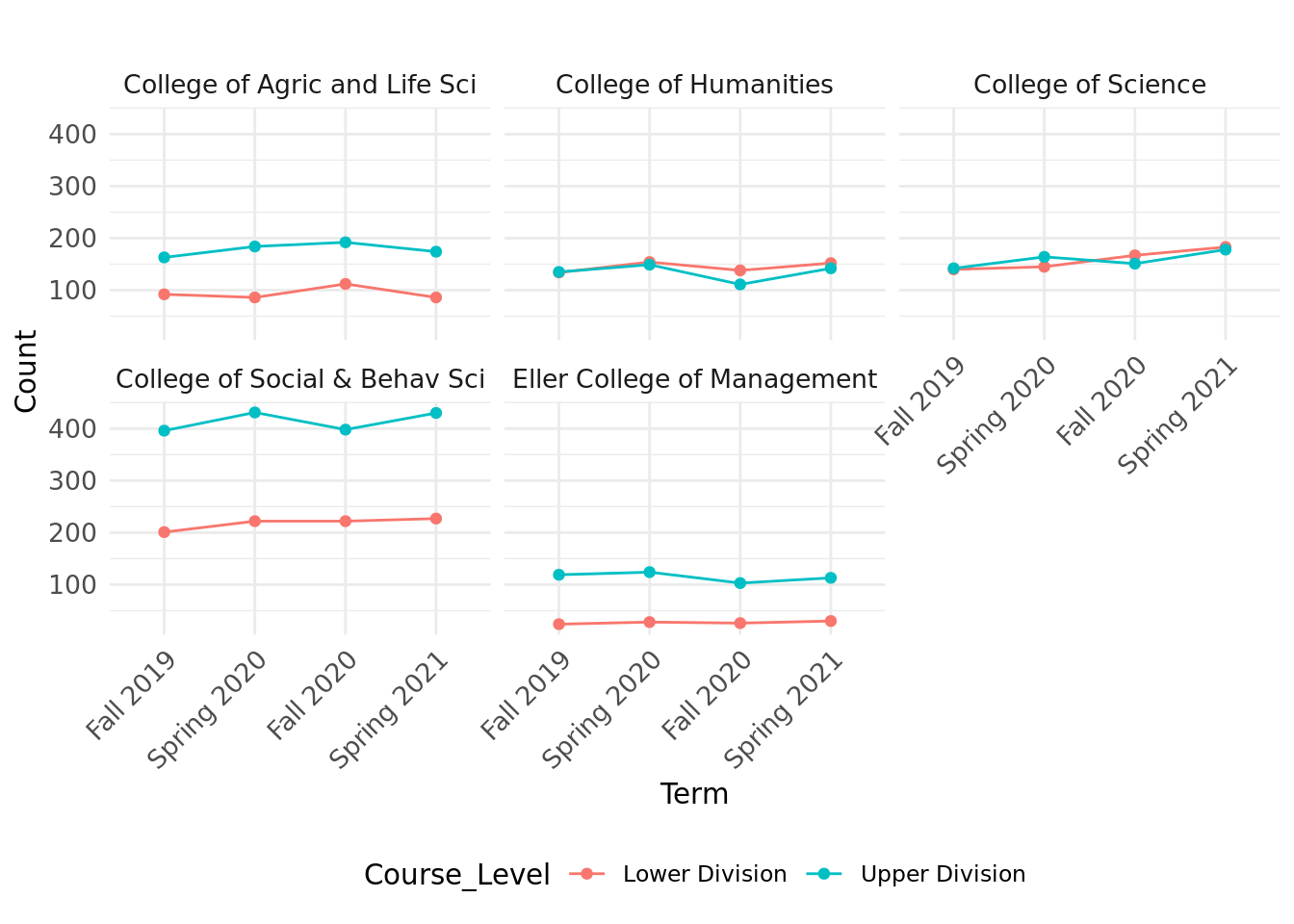
Caption: This graph shows the total number of courses offered by divison level (lower or upper division) over semesters. College of Humanities and College of Science have similar rate of courses in both divisions but the others have a higher number of upper division classes than the lower division ones.
# Number of students attending classes in different time slots for the colleges

# Create the table for each time slot
time_slots <- c("Early_Morning", "Mid_Morning", "Early_Afternoon", "Mid_Afternoon", "Evening", "Asynchronous")

tables_list <- lapply(time_slots, function(slot) {
  table_data <- filtered_data%>%
    group_by(College, TERM_LD) %>%
    summarise(Total_Classes_Attended = sum(!!sym(slot), na.rm = TRUE))
})

# Modify column names of the tables within tables_list
for (i in 1:length(tables_list)) {
  col_name <- paste("Total ", time_slots[i], sep = "")  # Generate new column name
  names(tables_list[[i]])[3] <- col_name  # Assign new column name to the last column
}

# Merge tables into a single table
merged_table <- reduce(tables_list, full_join, by = c("College", "TERM_LD"))

# Melt the data for plotting
merged_table_long <- tidyr::pivot_longer(merged_table, cols = starts_with("Total"),
                                         names_to = "Time_Slot", values_to = "Total_Classes_Attended")

# Convert TERM_LD to factor with ordered levels
merged_table_long$TERM_LD <- factor(
  merged_table_long$TERM_LD,
  levels = selected_terms,
  ordered = TRUE
)

# Plotting the facet plot with chronological x-axis
plot4<-ggplot(merged_table_long, aes(x = TERM_LD, y = Total_Classes_Attended, color = Time_Slot, group = Time_Slot)) +
  geom_line() +
  facet_wrap(~ College) +
  labs(
    title = "",
    x = "Term ID",
    y = "Total Classes Attended"
  ) +
  theme_minimal() +
  theme(axis.text.x = element_text(angle = 45, hjust = 1,  size=10), axis.text.y = element_text(size=10),
        strip.text = element_text(size = 10, angle = 0, hjust = 0.5),
        legend.position = "bottom",  # Place legend at the bottom
        legend.direction = "horizontal",  # Display legend horizontally
        legend.box = "horizontal") # Align legend items horizontally

plot4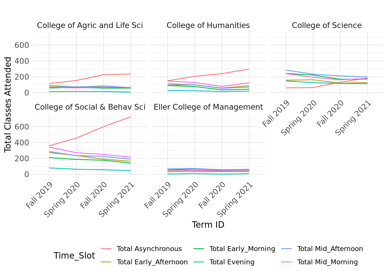
Caption: This graph shows the total number of course offerings for different time over semesters. The interesting insight here is that more asynchronous classes were offered when compared to all other different slots, especially in the College of Social and Behavioral Sciences.
# Number of students attending classes in different days of the week

# Create a table for each day of the week
weekdays <- c("Monday", "Tuesday", "Wednesday", "Thursday", "Friday")

tables_list <- lapply(weekdays, function(slot) {
  table_data <- filtered_data%>%
    group_by(College, TERM_LD) %>%
    summarise(Total_Classes_Attended = sum(!!sym(slot), na.rm = TRUE))
})

# Modify column names of the tables within tables_list
for (i in 1:length(tables_list)) {
  col_name <- paste("Total_", weekdays[i], sep = "")  # Generate new column name
  names(tables_list[[i]])[3] <- col_name  # Assign new column name to the last column
}

# Merge tables into a single table
merged_table <- reduce(tables_list, full_join, by = c("College", "TERM_LD"))

# Melt the data for plotting
merged_table_long <- tidyr::pivot_longer(merged_table, cols = starts_with("Total"),  names_to = "Time_Slot", values_to = "Total_Classes_Attended")

# Convert TERM_LD to factor with ordered levels
merged_table_long$TERM_LD <- factor(
  merged_table_long$TERM_LD,
  levels = selected_terms,
  ordered = TRUE
)

# Convert Time_Slot to factor with ordered levels
merged_table_long$Time_Slot <- factor(
  merged_table_long$Time_Slot,
  levels = paste("Total_", weekdays, sep = ""),
  ordered = TRUE
)

# Plotting the facet plot
plot5<-ggplot(merged_table_long, aes(x = TERM_LD, y = Total_Classes_Attended, color = Time_Slot, group = Time_Slot)) +
  geom_line() +
  facet_wrap(~ College, scales = "free") +
  labs(
    title = "",
    x = "Term ID",
    y = "Total Classes Attended"
  ) +
  theme_minimal() +
  theme(axis.text.x = element_text(angle = 45, hjust = 1, size = 10), axis.text.y = element_text(size=10),
        strip.text = element_text(size = 10, angle = 0, hjust = 0.5),
        legend.position = "bottom",  # Place legend at the bottom
        legend.direction = "horizontal",  # Display legend horizontally
        legend.box = "horizontal") # Align legend items horizontally

plot5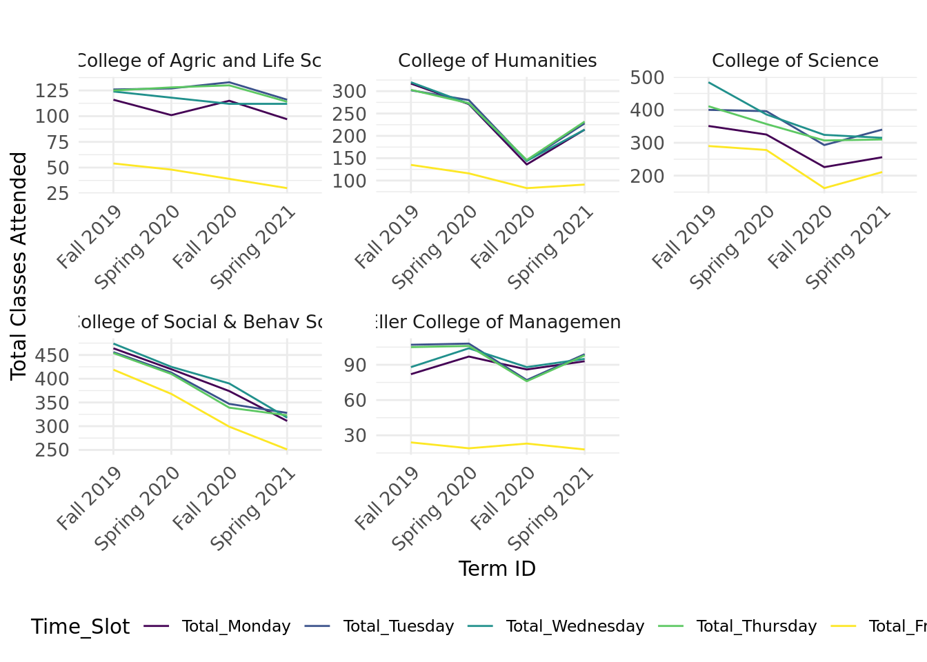
Caption: This graph shows the total number of classes by different days of the week over semesters. Here, it is clear that a smaller number of classes were offered on Fridays when compared to other days of the week. Another interesting trend to observe is that there is a downfall in almost all colleges, which explains that increase of asynchronous classes in the recent semesters when compared to the earlier semesters.