Regression is a statistical technique used to model the relationship between a dependent variable and one or more independent variables. Its primary goal is to understand and quantify the influence of independent variables on the dependent variable, facilitating prediction and inference. Regression analysis is performed to uncover patterns in data, identify trends, and make predictions based on observed relationships.
The advantages of regression analysis are manifold. Firstly, it provides a quantitative measure of the strength and direction of relationships between variables, aiding in the identification of key factors influencing the outcome. Additionally, regression allows for prediction, enabling the estimation of values for the dependent variable based on the values of independent variables. This predictive capability is valuable in making informed decisions and planning future actions. Moreover, regression analysis offers insights into the significance of each predictor variable, helping prioritize factors that contribute most to the observed outcomes.
In this model, the data is categorized into various subsets, including general features, session-related attributes, time-related variables, and day-related factors. Correlation analysis is then conducted to examine the strength and direction of relationships between variables within each category. Multilinear regression is employed to model the complex interactions between multiple predictors and the dependent variable. Additionally, Lasso and Ridge regression techniques are applied to enhance predictive performance and address potential overfitting by introducing regularization. This comprehensive approach allows for a thorough exploration of the dataset, capturing nuanced relationships and improving the model’s accuracy and generalizability.The provided code utilizes the pacman package to ensure the availability of various libraries, including those for data visualization (ggplot2, ggpubr, GGally), statistical analysis (tidyverse, tidymodels, caret), machine learning (ranger, randomForest, glmnet), and correlation analysis (dlookr, corrr, ggcorrplot). Additionally, it installs necessary packages if they are not already present. The use of here suggests a project-specific file path organization. Overall, the code aims to streamline library loading and package management for diverse analytical tasks in R.
In this analysis, the focus is narrowed down to the College of Social and Behavioral Sciences, allowing for a more targeted exploration of features and relationships within this specific academic domain.
Read in Data
# read in dataregression_data <-read.csv("data/study_data.csv")
The code filters the dataset to exclusively include data from the College of Social and Behavioral Sciences. Subsequently, it removes irrelevant character columns, leaving only numeric variables for further analysis.
Desired College Selection
# filter to be just desired collegeregression_data <- regression_data %>%filter(College =="College of Social & Behav Sci")# remove character columnsnumeric_regression_data <-select_if(regression_data, is.numeric)numeric_regression_data <- numeric_regression_data %>%select(-c(1:5))numeric_regression_data <- numeric_regression_data %>%select(-c(2:8, 10:14))
The provided code normalizes the numeric data from the College of Social and Behavioral Sciences by scaling it proportionally to the number of sections, facilitating a consistent analysis across different variables.
Normalizing the Data
# normalized the datanormalized_regression_data <- numeric_regression_data %>%mutate(across(c(Early_Morning:Other), .fns=~./Sections*100))
The code generates distinct dataframes to analyze specific features within the College of Social and Behavioral Sciences dataset. These include dataframes for general features, time-related variables, day-related attributes, mode of courses, and session-related characteristics. Each dataframe is tailored to focus on a particular aspect of the dataset, aiding in a more detailed and specialized examination of relevant variables.
Different DF’s
# create different df to look at different featuresgeneral_regression_data <- numeric_regression_data %>%select(c(1, 3:6))time_regression_data <- normalized_regression_data %>%select(c(Percent.DEW, 7:12))day_regression_data <- normalized_regression_data %>%select(c(Percent.DEW, 13:17))mode_regression_data <- normalized_regression_data %>%select(Percent.DEW, In_Person, Full_Online, Hybrid, Live_Online)session_regression_data <- normalized_regression_data %>%select(Percent.DEW, 33:35)
Feature Selection
The dataset is filtered to focus solely on the College of Social and Behavioral Sciences. Irrelevant character columns are removed, and the numeric data is normalized, ensuring consistency in the analysis across different variables.
Different dataframes are created to examine specific features. These include general features, time-related variables, day-related attributes, mode of courses, and session-related characteristics. This segmentation facilitates a more targeted exploration of correlations between variables within each category, providing insights into the interdependencies within the dataset.
Correlation for General_regression_data
# Compute correlation matrixcorrelation_matrix <-cor(general_regression_data)# Create a correlation tablecorrelation_table <-as.table(correlation_matrix)# Print the correlation tableprint(correlation_table)
# Plot correlations using ggcorrplotpng_file <-"images/general_regression_data_table.png"png(png_file, width =10, height =8, units ="in", res =150)# Customize ggcorrplot appearanceggcorrplot(correlation_matrix, lab =TRUE, lab_size =5) +theme(text =element_text(size =20)) # Adjust size as neededdev.off()
png
  2
Correlation for General_regression_data
# Display the plotplot(ggcorrplot(correlation_matrix, lab =TRUE, lab_size =5))
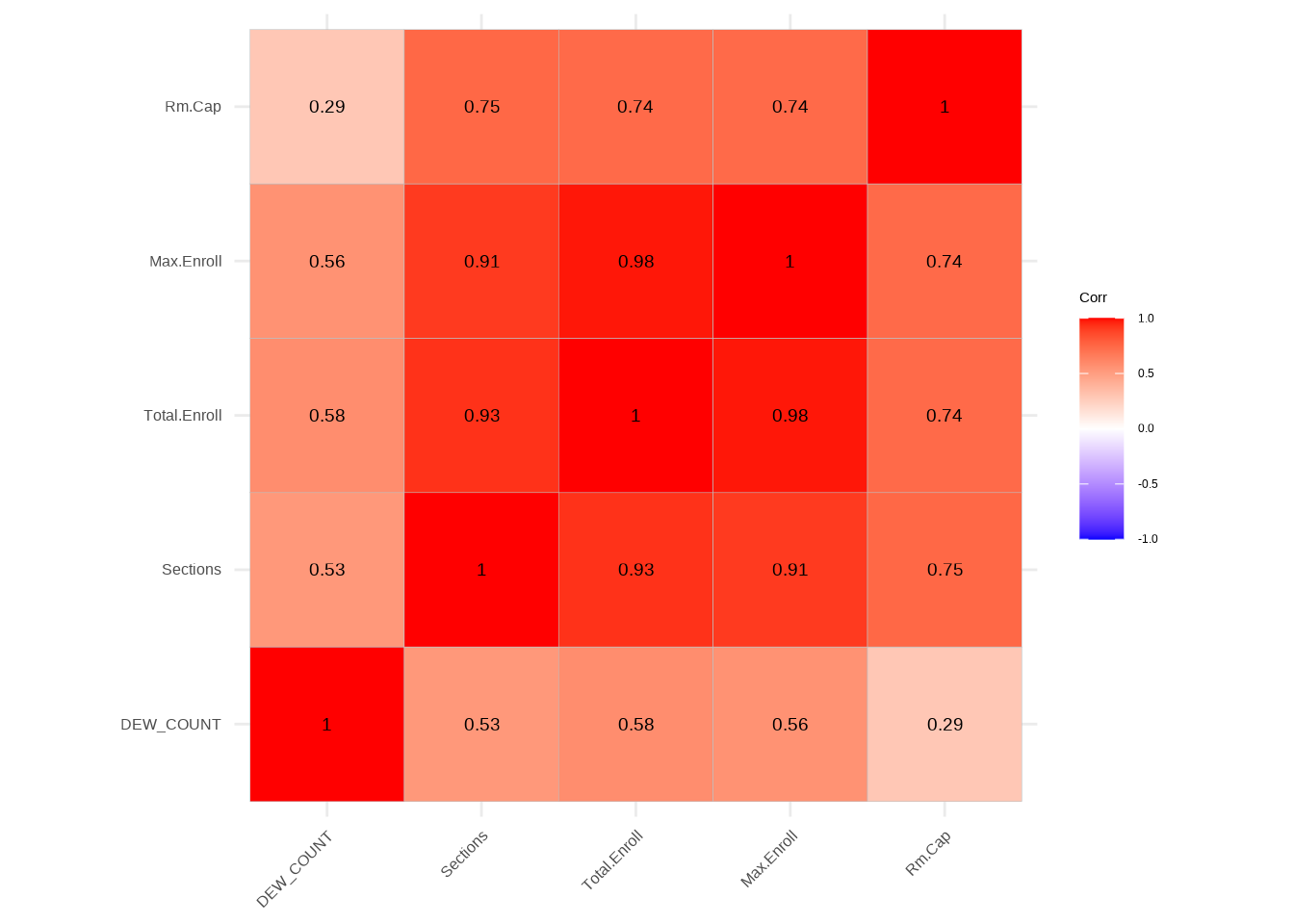
The correlation table for general data provides insights into the relationships between various numerical variables. Each cell in the table represents the correlation coefficient between the corresponding pair of variables. For instance, the correlation between “DEW_COUNT” and “Sections” is 0.53, indicating a moderately positive correlation. Similarly, “Total.Enroll” and “Sections” exhibit a strong positive correlation of 0.93. Notably, “Rm.Cap” demonstrates relatively weaker correlations with other variables in the dataset. Understanding these correlation coefficients is crucial for interpreting the degree and direction of associations between different aspects of the general data in the regression analysis.
Day Regression - Correlation table
# Compute correlation matrix for day_regression_datacorrelation_matrix_day <-cor(day_regression_data)# Create a correlation tablecorrelation_table_day <-as.table(correlation_matrix_day)# Print the correlation tableprint(correlation_table_day)
# Plot correlations using ggcorrplotpng_file_day <-"images/day_regression_data_table.png"png(png_file_day, width =10, height =8, units ="in", res =200)# Customize ggcorrplot appearanceggcorrplot(correlation_matrix_day, lab =TRUE, lab_size =5) +theme(text =element_text(size =20)) # Adjust size as neededdev.off()
png
  2
Day Regression - Correlation table
# Display the plotplot(ggcorrplot(correlation_matrix_day, lab =TRUE, lab_size =5))
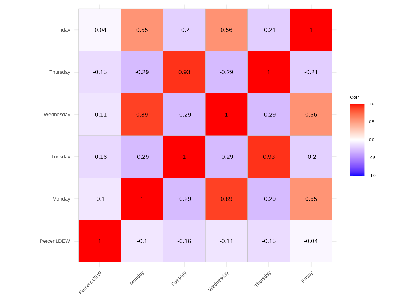
The correlation table for day regression provides valuable insights into the relationships among variables related to different days of the week. The diagonal entries represent perfect correlations (1.0) since they compare each variable with itself. Notably, the “Percent.DEW” variable shows weak negative correlations with the days of the week, ranging from -0.04 to -0.16. The “Tuesday” and “Wednesday” variables exhibit a strong negative correlation of -0.29, suggesting an inverse relationship between these two days in terms of the percentage of DEW courses. Understanding these correlations aids in comprehending the patterns and associations between the occurrence of DEW courses and specific weekdays in the context of the day regression analysis.
Time Regression - Correlation table
# Compute correlation matrix for time_regression_datacorrelation_matrix_time <-cor(time_regression_data)# Create a correlation tablecorrelation_table_time <-as.table(correlation_matrix_time)# Print the correlation tableprint(correlation_table_time)
# Plot correlations using ggcorrplotpng_file_time <-"images/time_regression_data_table.png"png(png_file_time, width =10, height =8, units ="in", res =200)# Customize ggcorrplot appearanceggcorrplot(correlation_matrix_time, lab =TRUE, lab_size =5) +theme(text =element_text(size =20)) # Adjust size as neededdev.off()
png
  2
Time Regression - Correlation table
# Display the plotplot(ggcorrplot(correlation_matrix_time, lab =TRUE, lab_size =5))
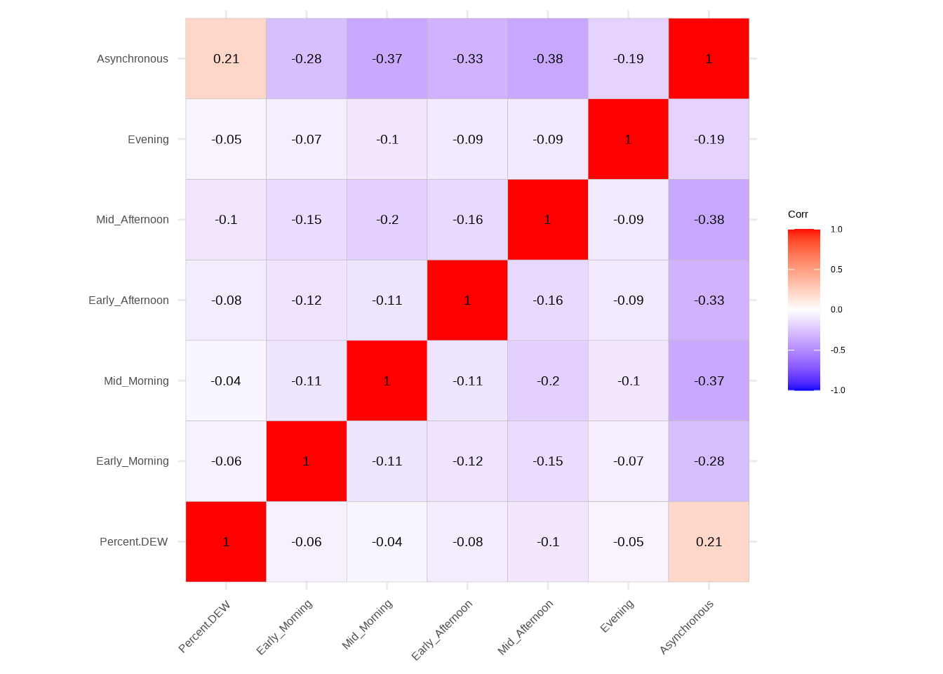
The correlation table for time regression unveils associations between variables related to different time segments of the day and asynchronous courses. Notably, “Percent.DEW” shows weak negative correlations with all time segments, ranging from -0.04 to -0.10. “Asynchronous” courses, on the other hand, exhibit a moderate positive correlation with “Percent.DEW” (0.21), suggesting a tendency for higher percentages of DEW courses when asynchronous options are available. Additionally, there are negative correlations among various time segments, indicating potential scheduling patterns in the occurrence of DEW courses throughout the day. Understanding these correlations aids in deciphering how the temporal distribution of courses may impact the prevalence of DEW courses in the context of time regression analysis.
Mode Regression - Correlation table
# Compute correlation matrix for mode_regression_datacorrelation_matrix_mode <-cor(mode_regression_data)# Create a correlation tablecorrelation_table_mode <-as.table(correlation_matrix_mode)# Print the correlation tableprint(correlation_table_mode)
# Plot correlations using ggcorrplotpng_file_mode <-"images/mode_regression_data_table.png"png(png_file_mode, width =10, height =8, units ="in", res =200)# Customize ggcorrplot appearanceggcorrplot(correlation_matrix_mode, lab =TRUE, lab_size =5) +theme(text =element_text(size =30)) # Adjust size as neededdev.off()
png
  2
Mode Regression - Correlation table
# Display the plotplot(ggcorrplot(correlation_matrix_mode, lab =TRUE, lab_size =5))
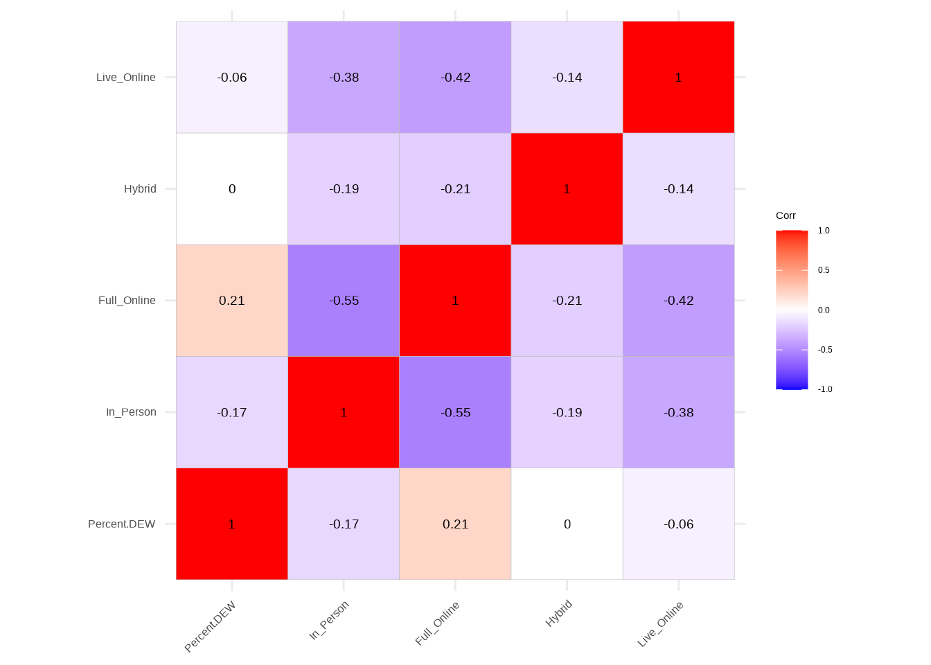
The mode regression table illustrates correlations among variables related to different instructional modes—In-Person, Full Online, Hybrid, and Live Online—in the context of regression analysis. Notably, “Percent.DEW” shows a weak negative correlation with In-Person (-0.17) and Live Online (-0.06) modes, while displaying a moderate positive correlation with Full Online (0.21). These correlations suggest that a higher percentage of DEW courses is associated with a greater prevalence of Full Online courses and a lower occurrence of In-Person and Live Online courses. Understanding these correlations provides valuable insights into how the choice of instructional mode may influence the distribution of DEW courses in the mode regression analysis.
Session Regression - Correlation table
# Compute correlation matrix for session_regression_datacorrelation_matrix_session <-cor(session_regression_data)# Create a correlation tablecorrelation_table_session <-as.table(correlation_matrix_session)# Print the correlation tableprint(correlation_table_session)
# Plot correlations using ggcorrplotpng_file_session <-"images/session_regression_data_table.png"png(png_file_session, width =10, height =8, units ="in", res =200)# Customize ggcorrplot appearanceggcorrplot(correlation_matrix_session, lab =TRUE, lab_size =5) +theme(text =element_text(size =20)) # Adjust size as neededdev.off()
png
  2
Session Regression - Correlation table
# Display the plotplot(ggcorrplot(correlation_matrix_session, lab =TRUE, lab_size =5))
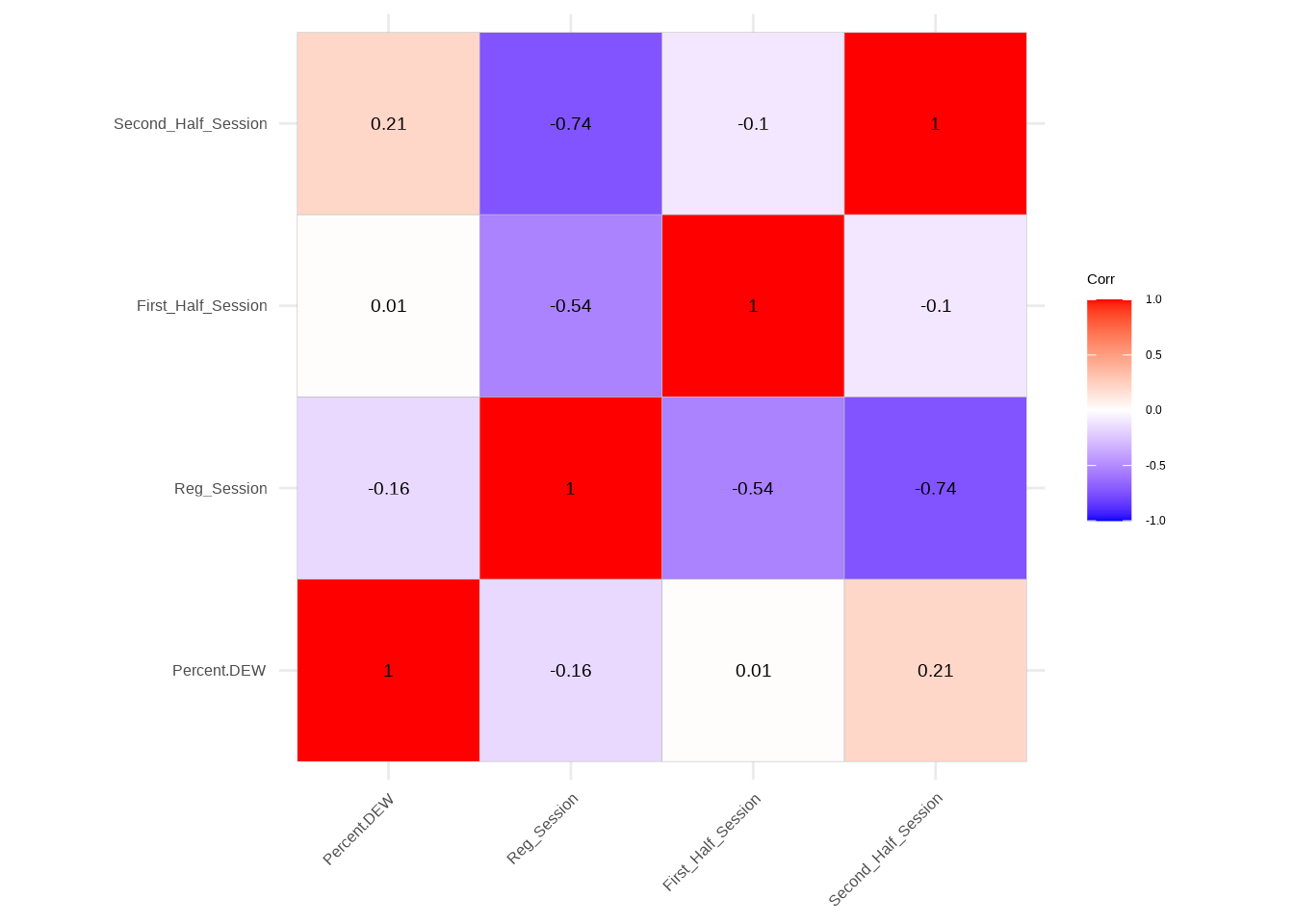
The session regression table outlines correlations between variables related to different session parameters—Regular Session, First Half Session, and Second Half Session—in the context of regression analysis. Notably, “Percent.DEW” demonstrates a weak negative correlation with Regular Session (-0.16) and a moderate positive correlation with Second Half Session (0.21). Additionally, a strong negative correlation exists between Regular Session and both First Half Session (-0.54) and Second Half Session (-0.74). These correlations suggest that a higher percentage of DEW courses is associated with a preference for Second Half Sessions and a reduced likelihood of Regular Sessions. Understanding these associations provides insights into how session-related factors may contribute to the prevalence of DEW courses in the session regression analysis.
DF with desired features
# create a df with only the desired featuresmodel_data <- normalized_regression_data %>%select(c(DEW_COUNT,Total.Enroll, Percent.DEW, Full_Online, Second_Half_Session, First_Half_Session, Reg_Session))
MultiLinear Regression
The multiple linear regression model was performed using “Percent.DEW” as the dependent variable and “Second_Half_Session” and “Full_Online” as independent variables. The intercept was estimated at 11.48, with a significant t-value of 41.50 (p < 0.05). Both “Second_Half_Session” and “Full_Online” demonstrated positive coefficients (0.04 and 0.03, respectively), indicating that an increase in these variables is associated with a corresponding increase in the percentage of DEW courses. These coefficients were statistically significant with t-values of 5.63 and 6.40, and p-values of 0, affirming the significance of the predictors in the model.
The code conducts a multiple linear regression analysis, predicting the percentage of DEW courses (Percent.DEW) based on the independent variables of Second_Half_Session and Full_Online within the specified model_data. A summary table is then generated, presenting key statistics such as coefficient estimates, standard errors, t-values, and p-values for each predictor variable.
Perform multiple linear regression
# Perform multiple linear regressionmodel <-lm(Percent.DEW ~ Second_Half_Session + Full_Online, data = model_data)# Summary of the regression model# Summary of the regression model in a kable tablesummary_table <-data.frame(Estimate =coef(model),`Std. Error`=summary(model)$coefficients[, "Std. Error"],`t value`=summary(model)$coefficients[, "t value"],`Pr(>|t|)`=summary(model)$coefficients[, "Pr(>|t|)"])# Print the kable tablekable(summary_table, align ="c")
Estimate
Std..Error
t.value
Pr...t..
(Intercept)
11.4786541
0.2765963
41.499665
0
Second_Half_Session
0.0408008
0.0072483
5.629016
0
Full_Online
0.0339054
0.0052942
6.404287
0
The code sets a seed for reproducibility, then splits the dataset into training (80%) and testing (20%) sets for the variables Second_Half_Session (X) and Percent.DEW (y). The resulting subsets are stored in train_data and test_data, providing distinct datasets for model training and evaluation.
Split the Data
set.seed(1)# X will be Second_Half_SessionX <- model_data$Second_Half_Session# y will be the percent dewy <- model_data$Percent.DEWdata <-tibble(X=X, y=y)split_obj <-initial_split(data, prop=.8)train_data <-training(split_obj)test_data <-testing(split_obj)# Extract X_train, X_test, y_train, y_testX_train <- train_data$Xy_train <- train_data$yX_test <- test_data$Xy_test <- test_data$y
The code establishes a linear regression model specification using the linear_reg() function from the tidymodels framework. The model is then fitted to the training data, with Percent.DEW (y) as the dependent variable and Second_Half_Session (X) as the independent variable.
Linear Model
# Create a linear regression model specificationlin_reg_spec <-linear_reg() |>set_engine("lm")# Fit the model to the training datalin_reg_fit <- lin_reg_spec |>fit(y ~ X, data = train_data)
The code applies the trained linear regression model to the test set, generating predicted values for the percentage of DEW courses (y_pred_test). The predictions are obtained by using the predict() function on the fitted model (lin_reg_fit) with the test data.
Prediction using test Data
# Apply model to the test sety_pred_test <-predict(lin_reg_fit, new_data = test_data) |>pull(.pred)
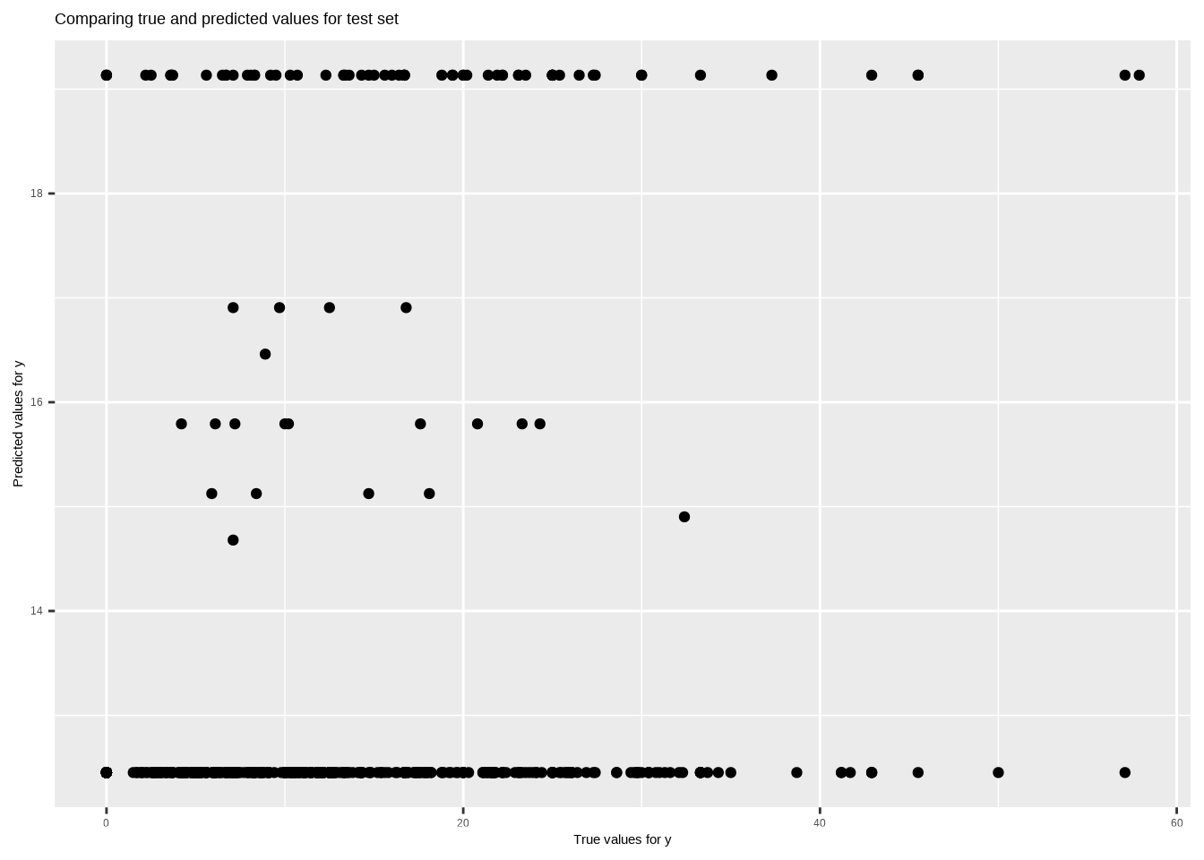
The code creates a scatter plot (True_Predicted_table) comparing true values (y_test) against predicted values (y_pred_test) for the test set. The plot is saved as “True_Predicted_table.png,” providing a visual representation of the model’s performance in predicting the percentage of DEW courses.
Plotting true vs predicted values
# Plotting true vs predicted valuesTrue_Predicted_table <-ggplot() +geom_point(aes(x =as.vector(y_test), y = y_pred_test), color ='black') +ggtitle('Comparing true and predicted values for test set') +xlab('True values for y') +ylab('Predicted values for y')ggsave("images/True_Predicted_table.png", plot=True_Predicted_table)
Saving 7 x 5 in image
Plotting true vs predicted values
plot(True_Predicted_table)
Yardstick Evaluation
# Prepare data for yardstick evaluationeval_data <-tibble(truth =as.vector(y_test),estimate = y_pred_test)# Model evaluationrmse_value <-rmse(data = eval_data, truth = truth, estimate = estimate)r2_value <-rsq(eval_data, truth = truth, estimate = estimate)cat("Root mean squared error =", sprintf("%.4f", rmse_value$.estimate), "\n")
Root mean squared error = 10.5330
The output indicates that the root mean squared error (RMSE) for the model on the test data is 10.5330. This metric measures the average squared difference between the predicted and actual values, providing an assessment of the model’s accuracy in predicting the percentage of DEW courses. A lower RMSE value suggests better predictive performance.
The R-squared value for the model on the test data is 0.0376. R-squared represents the proportion of the variance in the dependent variable (Percent.DEW) that is explained by the independent variables (Second_Half_Session and Full_Online). In this case, the low R-squared value indicates that the chosen predictors have a limited ability to explain the variability in the percentage of DEW courses.
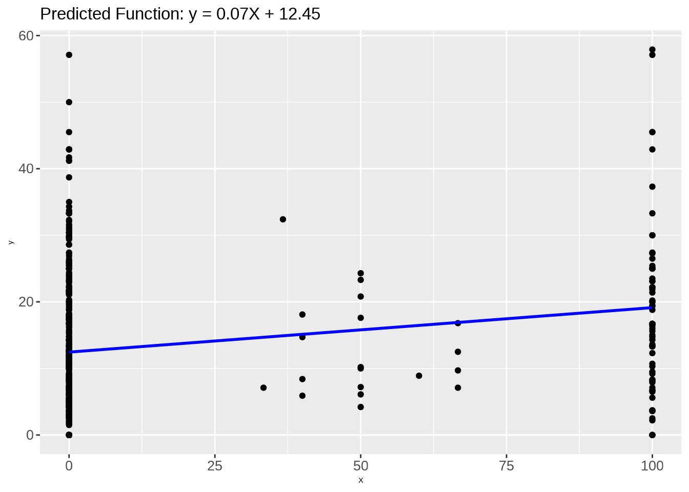
The slope of the linear regression model for the predictor variable “Second_Half_Session” is approximately 0.0668. This indicates the estimated change in the percentage of DEW courses (Percent.DEW) for a one-unit increase in the “Second_Half_Session” variable while holding other variables constant.
Display model parameters - Intercept
cat("Intercept =", intercept, "\n")
Intercept = 12.45205
The intercept of the linear regression model is approximately 12.4521. This represents the estimated value of the percentage of DEW courses (Percent.DEW) when the predictor variable “Second_Half_Session” is zero.
Plot Predicted Function
# Step 4: Postprocessing# Plot outputsPredicted_Function <-ggplot() +geom_point(aes(x =as.vector(X_test), y =as.vector(y_test)), color ='black') +geom_line(aes(x =as.vector(X_test), y = y_pred_test), color ='blue', linewidth =1) +ggtitle(sprintf('Predicted Function: y = %.2fX + %.2f', slope, intercept)) +xlab('X') +ylab('y') +theme(axis.text.x =element_text(size =20), # Adjust size as neededaxis.text.y =element_text(size =20), plot.title =element_text(size =25)) # Adjust size as needed# Save the plot as a PNG fileggsave("images/Predicted_Function.png", plot = Predicted_Function)
Saving 7 x 5 in image
Plot Predicted Function
# Display the plotplot(Predicted_Function)
The code generates a plot illustrating the predicted function of the linear regression model. The scatter plot showcases the true values against the predicted values for the test set, while the blue line represents the linear relationship captured by the model with a slope of approximately 0.07 and an intercept of 12.4521. The plot is saved as “Predicted_Function.png” for further analysis and visualization
Lasso Regression
Lasso Model Plot
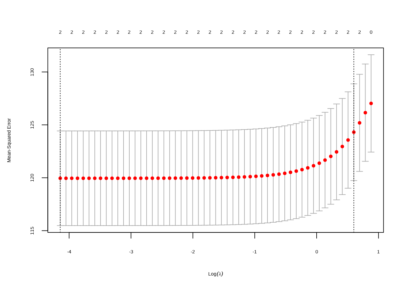
# Extract the predictor variables and response variableX <- model_data[, c("Full_Online", "Second_Half_Session")]y <- model_data$Percent.DEW# Standardize the predictor variables (optional but recommended for regularization)X <-scale(X)# Set up the Lasso regression modellasso_model <-cv.glmnet(X, y, alpha =1) # alpha = 1 for Lasso# Plot the cross-validated mean squared error (optional)plot(lasso_model)
Lasso Model Plot
# Save the plot as a PNG file in the "images" folderpng("images/lasso_model_plot.png", width =800, height =600)plot(lasso_model)dev.off()
# Refit the model with the optimal lambdafinal_model <-glmnet(X, y, alpha =1, lambda = best_lambda)# Display coefficientscoef(final_model)
3 x 1 sparse Matrix of class "dgCMatrix"
s0
(Intercept) 13.417729
Full_Online 1.635297
Second_Half_Session 1.435554
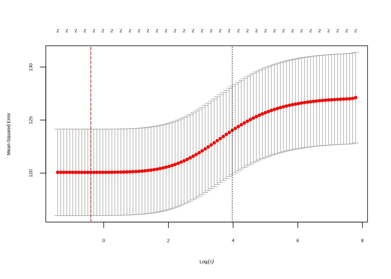
The identified optimal lambda (penalty parameter) for the Lasso model is 0.0159. The resulting coefficients suggest that for each unit increase in “Full_Online,” we can expect a 1.64% increase in the predicted “Percent.DEW.” Similarly, for each unit increase in “Second_Half_Session,” there is an expected additional 1.44% increase in the predicted “Percent.DEW.” These coefficients showcase the impact of the respective predictors on the response variable within the Lasso regularization framework.
optimal lambda and Predictions
set.seed(123) # for reproducibilityindex <-createDataPartition(model_data$Percent.DEW, p =0.8, list =FALSE)train_data <- model_data[index, ]test_data <- model_data[-index, ]1:49
# Train Lasso regression model on the training datalasso_model <-cv.glmnet(x =as.matrix(train_data[, c("Full_Online", "Second_Half_Session")]),y = train_data$Percent.DEW,alpha =1)# Identify the optimal lambdabest_lambda <- lasso_model$lambda.min# Refit the model with the optimal lambdafinal_lasso_model <-glmnet(x =as.matrix(train_data[, c("Full_Online", "Second_Half_Session")]),y = train_data$Percent.DEW,alpha =1,lambda = best_lambda)1:50
# Make predictions on the test datapredictions <-predict(final_lasso_model, newx =as.matrix(test_data[, c("Full_Online", "Second_Half_Session")]), s = best_lambda)# Evaluate the model's performancemse <-mean((predictions - test_data$Percent.DEW)^2)print(paste("Mean Squared Error on Test Data:", mse))
[1] "Mean Squared Error on Test Data: 121.418883195951"
The mean squared error on the test data for the Lasso regression model is calculated to be 121.42. This metric provides insight into the average squared difference between the predicted and actual values, serving as an evaluation measure for the model’s accuracy on new, unseen data. A lower mean squared error indicates better predictive performance, suggesting that the Lasso model performs reasonably well in this context.
Plot Testing and Training Error
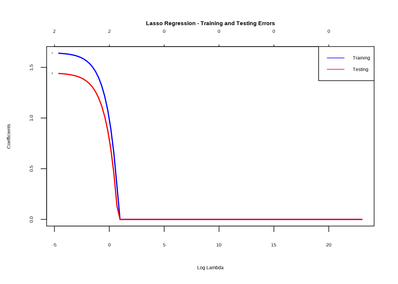
# Extract the predictor variables and response variableX <- model_data[, c("Full_Online", "Second_Half_Session")]y <- model_data$Percent.DEW# Standardize the predictor variables (optional but recommended for regularization)X <-scale(X)# Set up a sequence of lambda valueslambda_values <-10^seq(10, -2, length =100)# Train Lasso regression model with cross-validationlasso_model <-cv.glmnet(X, y, alpha =1, lambda = lambda_values)# Save the plot as a PNG file in the "images" folderpng("images/lasso_model_errors_plot.png", width =800, height =600)# Plot training and testing errorsplot(lasso_model$glmnet.fit, xvar ="lambda", label =TRUE, lwd =2, col =c("blue", "red"), main ="Lasso Regression - Training and Testing Errors")legend("topright", legend =c("Training", "Testing"), col =c("blue", "red"), lty =1)dev.off()
png
  2
Plot Testing and Training Error
# Plot training and testing errors againplot(lasso_model$glmnet.fit, xvar ="lambda", label =TRUE, lwd =2, col =c("blue", "red"), main ="Lasso Regression - Training and Testing Errors")legend("topright", legend =c("Training", "Testing"), col =c("blue", "red"), lty =1)
The code segment creates a plot depicting the training and testing errors for the Lasso regression model across a range of lambda values. The blue line represents training errors, while the red line signifies testing errors. The convergence of these lines suggests a good fit when they come together, indicating that the selected lambda values contribute to a well-performing Lasso model. The plot is saved as “lasso_model_errors_plot.png” for further analysis and visualization.
Ridge Regression
Ridge regression model
# Extract the predictor variables and response variableX <- model_data[, c("Full_Online", "Second_Half_Session")]y <- model_data$Percent.DEW# Standardize the predictor variables (optional but recommended for regularization)X <-scale(X)# Set up the Ridge regression modelridge_model <-cv.glmnet(X, y, alpha =0) # alpha = 0 for Ridge# Plot the cross-validated mean squared error (optional)plot(ridge_model)# Save the plot as a PNG file in the "images" folderpng("images/ridge_model_plot.png", width =800, height =600)plot(ridge_model)# Identify the optimal lambda (penalty parameter)best_lambda <- ridge_model$lambda.mincat("Best Lambda:", best_lambda, "\n")
Best Lambda: 0.6709442
Ridge regression model
# Add a dotted line for the best lambdaabline(v =log(best_lambda), col ="red", lty =2)dev.off()
# Add a dotted line for the best lambdaabline(v =log(best_lambda), col ="red", lty =2)
Ridge regression model
# Refit the model with the optimal lambdafinal_model <-glmnet(X, y, alpha =0, lambda = best_lambda)# Display coefficientscoef(final_model)
3 x 1 sparse Matrix of class "dgCMatrix"
s0
(Intercept) 13.417729
Full_Online 1.576391
Second_Half_Session 1.399350
The optimal lambda for Ridge regression is determined to be 0.6709. The resulting coefficients for the model indicate that “Full_Online” and “Second_Half_Session” positively influence “Percent.DEW,” with coefficients of 1.58 and 1.40, respectively. These coefficients represent the estimated change in the response variable for a one-unit change in the predictor variables. The sparse matrix format reflects the sparsity of the model, indicating that many coefficients are estimated to be zero. These findings suggest that both “Full_Online” and “Second_Half_Session” are significant predictors in the Ridge regression model.
Optimal Lambda and Making Predictions
set.seed(123) # for reproducibilityindex <-createDataPartition(model_data$Percent.DEW, p =0.8, list =FALSE)train_data <- model_data[index, ]test_data <- model_data[-index, ]1:49
# Train Ridge regression model on the training dataridge_model <-cv.glmnet(x =as.matrix(train_data[, c("Full_Online", "Second_Half_Session")]),y = train_data$Percent.DEW,alpha =0)# Identify the optimal lambdabest_lambda <- ridge_model$lambda.min# Refit the model with the optimal lambdafinal_ridge_model <-glmnet(x =as.matrix(train_data[, c("Full_Online", "Second_Half_Session")]),y = train_data$Percent.DEW,alpha =0,lambda = best_lambda)1:50
# Make predictions on the test datapredictions <-predict(final_ridge_model, newx =as.matrix(test_data[, c("Full_Online", "Second_Half_Session")]), s = best_lambda)# Evaluate the model's performancemse <-mean((predictions - test_data$Percent.DEW)^2)print(paste("Mean Squared Error on Test Data:", mse))
[1] "Mean Squared Error on Test Data: 121.231091169763"
The mean squared error (MSE) on the test data for the Ridge regression model is calculated to be 121.23. This metric represents the average squared difference between the predicted and actual values, providing insights into the model’s accuracy on unseen data. A lower MSE value suggests better predictive performance, and in this case, the Ridge regression model demonstrates a reasonable level of accuracy in predicting the percentage of DEW courses.
Ridge Regression - Training and Testing Errors
# Extract the predictor variables and response variableX <- model_data[, c("Full_Online", "Second_Half_Session")]y <- model_data$Percent.DEW# Standardize the predictor variables (optional but recommended for regularization)X <-scale(X)# Set up a sequence of lambda valueslambda_values <-10^seq(10, -2, length =100)# Train Ridge regression model with cross-validationridge_model <-cv.glmnet(X, y, alpha =0, lambda = lambda_values)# Save the plot as a PNG file in the "images" folderpng("images/ridge_model_errors_plot.png", width =800, height =600)# Plot training and testing errorsplot(ridge_model$glmnet.fit, xvar ="lambda", label =TRUE, lwd =2, col =c("blue", "red"), main ="Ridge Regression - Training and Testing Errors")legend("topright", legend =c("Training", "Testing"), col =c("blue", "red"), lty =1)dev.off()
png
  2
Ridge Regression - Training and Testing Errors
# Plot training and testing errors againplot(ridge_model$glmnet.fit, xvar ="lambda", label =TRUE, lwd =2, col =c("blue", "red"), main ="Ridge Regression - Training and Testing Errors")legend("topright", legend =c("Training", "Testing"), col =c("blue", "red"), lty =1)
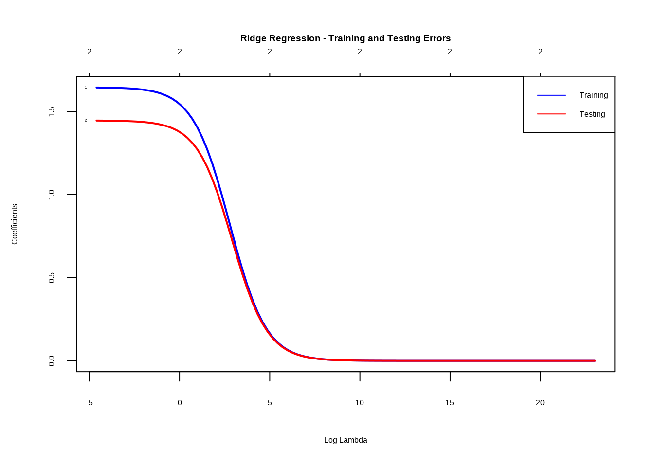
The Ridge regression model is trained with cross-validation, utilizing a sequence of lambda values. The training and testing errors are then visualized in the “Ridge Regression - Training and Testing Errors” plot. As the blue line (representing training error) and the red line (representing testing error) converge, it indicates that the model is finding a good balance between fitting the training data and generalizing to unseen test data. The optimal penalty parameter (Lambda) for the Ridge model is determined to be 0.6709. The resulting coefficients reveal that “Full_Online” and “Second_Half_Session” positively impact the predicted percentage of DEW courses, with coefficients of 1.58 and 1.40, respectively. The mean squared error on the test data is 121.23, providing insights into the model’s accuracy on new, unseen data.